Total Pageviews

Showing posts with label Christian. Show all posts

Thursday, 18 April 2013

ASSIGNMENT 2: 10 PIECE PORTFOLIO

              Now I've finally handed in the last creative thinking task of the year, it's time to collect all of my best work and present a 10 piece portfolio that demonstrates by talents - it is this, and only this that I will be marked on. Considering many of the tasks required two pieces of work, I decided to scrap some of my earlier work in favor for the new. I've progressed a lot in the last year so by doing this, I demonstrate by current ability more effectively whilst also avoiding unnecessary re-work that at this point in time, could cause more stress than it's worth.

All 10 pieces are below.


PIECE ONE - COLOUR AND LIGHTING
by Christian Whelan
PIECE TWO - IANTHE CHARACTER DESIGN
by Christian Whelan
PIECE THREE - ARMOUR DESIGN
by Christian Whelan
PIECE FOUR - WEAPON DESIGNS
by Christian Whelan
PIECE FIVE - DRIVER DESIGN
by Christian Whelan
PIECE SIX - VEHICLE DEISNG
by Christian Whelan
PIECE SEVEN - ENVIROMENT CONCEPT
by Christian Whelan
PIECE EIGHT - SEAN GALLOWAY MIMIC
by Christian Whelan
PIECE NINE - ASHLEY WOOD MIMIC
by Christian Whelan
PIECE ONE - MAREK OKON MIMIC
by Christian Whelan

      I really started to progress in my work by the environment concept. From that point on, I really tried to push myself when it came to rendering my art, and I think there'a been an incredible payoff. This is not to say my work cannot be improved however. The Ianthe, Armour, Sean Galloway and Marek Okon pieces are good, but not brilliant - each of them are a few stages off being at the level they 'could' be. Unfortunately, I do not have the time in this academic year to make such improvements.

     However, in all, I'm incredibly happy with my portfolio. Considering the standard of my work at the beginning of the year when compared to now, I can truly say I've progressed a long way, and that digital art is a new hobby of mine, where as at one point, it was a huge challenge.

NEXT POST: YEAR CONCLUSION

Sunday, 10 March 2013

LANDSCAPE CONCEPT (HAND-IN)

      This is by far my favourite task and piece for university that I've worked on. If I had to choose, environment art is definitely a route I'd like to explore further. I feel I could, and can, improve on my talents in this area - I really want to. Not that character or vehicle design bores me, it's just I like the idea of having an entire canvas to freely work on - the entire scene can become a character itself, and I love that.

After another hour of work, I finally finished my environment concept. It could still be improved, but I have no idea how to move forward with that - I need my tutor's criticism and advice. Regardless, I think I've done a good job and as I say, it's my favourite piece. Both it and I have come a long way since its basic line drawing, and I'm glad it changed the way it did. 

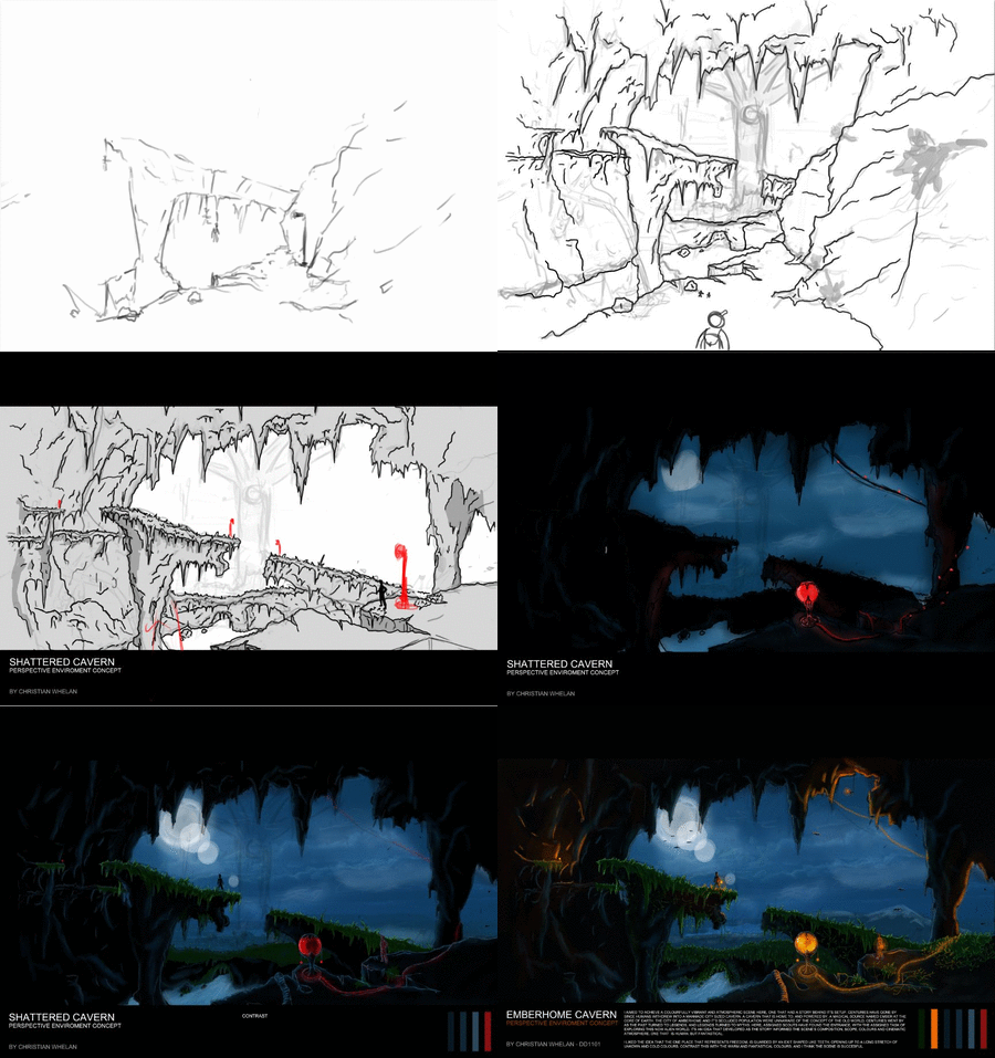
Have a look at the development .GIF below and the of course, the final concept.

COMMENTS AND CRITICISMS APPRECIATED!

CAVERN ENVIRONMENT CONCEPT - DEVELOPMENT .GIF
By Christian Whelan
CAVERN ENVIRONMENT CONCEPT
by Christian Whelan

    Don't get me wrong, it could be better. The foliage could be less cartoon like, the highlights could be more effective and the foreground could have a little more character and detail. However  compared to my usual standard of work, I think I've improved, and if there are any inconsistencies, I'm sure my tutor will highlight them so I can improve for future art.

I literally cannot wait to get this printed off on glossy paper. It's gonna look sexual. Yeayuh!

NEXT POST: STYLE MIXING: THE BRIEF

LANDSCAPE CONCEPT - PROGRESS 04/03/2013

        Spent a couple of hours refining some of the textures and making a drastic change with the colour palette. Rather than red, I opted for orange as a second lighting source. I don't know why I didn't think of this earlier, orange contrasts and compliments blue (the base colour for the scene). Red just doesn't fit in this vibrant scene any more. Finally, I've managed to capture some form of fantasy like atmosphere.

CAVERN ENVIRONMENT - IN PROGRESS
by Christian Whelan
 
Again, it's not finished, some of the lighting was placed to get an idea of its final positioning. I aim to carry this theme throughout the entire scene and add in some stalactite geometry (maybe?) to add depth and help define the lighting.

    A couple of additions have been made. I refined the grass texture, added in some vines (I hope to add in some moss), some water spray, water texture, further highlights and some bats on the horizon and within the cave. The bats will be great tool when coming to defining the scale of the scene with lighting.

    The idea was to have people residing within the cave, banished from a hostile world. There only methods of light is ember magic, the source of which was found within the cavern and harnessed when civilisation was forced to move underground. This scene captures their determination to venture outwards and far. 


It's just a case of adding in elements and refining everything within the scene now to ensure it's consistent and effective. Hopefully, by tomorrow, it should be done. There's no reason why it shouldn't be.


NEXT POST: LANDSCAPE CONCEPT (HAND-IN)

Saturday, 9 March 2013

LANDSCAPE CONCEPT - PROGRESS 03/03/2013

         Not had much time today to make any progress on my environment concept, but I made some progress that has given me ideas on how to progress with this work. With my last progress update, I'd adopted a new style and direction and had a light attempt at executing it. Today, after two hours of work (whilst watching Scarface) I added in the sky, further lighting and highlights, a character silhouette, a moon, a second lighting source and some grass. Have a look at my progress below., again, nowhere near finished.

ENVIRONMENT CONCEPT - IN PROGRESS
By Christian Whelan
ENVIRONMENT PROGRESS - GIF
by Christian Whelan
      Honestly, I have no idea why my GIFs are so temperamental nowadays. Anyway, you can see how it has improved upon the last milestone. However, the grass needs finishing, the red lighting source needs to be used in the scene and finally, the cave needs some damn colour. It's looking way to black.

      Some notable things to mention are the sky, the grass and the silhouette. Developing the sky and primary lighting source was a real help. It let me understand the colours and direction of light in the scene, telling me I needed some more colour - the grass. The grass is something that helps frame the horizon and create a focal point for the scene. Adding in the green highlights is what accomplished that, but it still needs development - at the moment, the grass seems out of place. Finally I added the silhouette  This was an attempt to one, add some life into the scene, and two, to highlight the scale of the environment because this was (and still is) an issue. More work needs to be done on that using lighting.

          At the moment, I'm happy with it, but I need another pair of eyes to look at it so I can move forward, luckily I'm visits my mother tomorrow - I'm sure she'll be brutally honest.

NEXT POST: LANDSCAPE CONCEPT - PROGRESS 04/03/2013

Friday, 8 March 2013

LANDSCAPE CONCEPT: PROGRESS 02/03/2013

           Painting an environment challenges everything creatively - composition  perspective, lighting, scaling, colour etc. My normal methods to approach all the aforementioned are restricting, plus, everything just ends up looking too bold, too 2 dimensional and too cartoonish - crap. I had to rethink my approach to concept art as a whole and in result, it absolutely changed everything.

   Now, it inst even remotely finished yet, I'm still finding my feet, brainstorming ideas for lighting and colour pallets. But by challenging myself, my art seems to adopt a theme and dare I say it, character.  Normally, my work would use one lighting source, no complimentary colours, and always the same pallet - black and red. It was just boring!

I aim to leave my restricting comfort zone from now on. I want to;

  • Stop being afraid of contrasting colours.
  • Stop using white and black alone to light scenes.
  • Develop my highlighting skills.
  • Focus less on detail at the start of work. 

So, after looking at concept art and theory books to develop my understanding of concept art as a whole, I took my first step at applying it to my scene (below).


CAVERN ENVIRONMENT (BEFORE) - IN PROGRESS
by Christian Whelan
CAVERN ENVIRONMENT (AFTER) - IN PROGRESS
by Christian Whelan
   You can see the difference between the first image and the second. If I would of gone down my usual cartoon like route, It would of ended up looking like a blind baby drew it with crayons and glue.

    Like I said, vary early in it's development  The second red lighting source was just an attempt to get an idea of things, I'll rework that later. At the moment  I need to get in the basic lighting, then add highlights until finally, adding in the red light and refining the back drop. I'm actually exciting to see how this turns out.

NEXT POST: LANDSCAPE CONCEPT - PROGRESS 03/03/2013

Thursday, 7 March 2013

LANDSCAPE CONCEPT: PROGRESS 01/03/2013

      I've always found the task of painting landscapes and environments daunting. It just seems like a huge task to craft a world using an entire canvas, not just a section of it! Maybe its the fact that the entire image has to be perfect for it to work, and my perfectionism along with my lack of experience cripples me when it comes to such a task. Anyhow, the tenth task at university is to draw a landscape using Manchester (or any other city) as inspiration.

    Well, after worrying about it, I threw myself into it in blind hope and for the most part, it turned out fine, but my intended perspective and scale went down the drain as it progressed, and I didn't like the way it way turning out, so I made some changes whilst envisioning the possible colour pallet of the environment.


Note: I have no idea why the GIF has a little panic attack on the last image. Every time 
I create it, it does the same thing. Maybe it's so terrible it doesn't want to look at it...


PERSPECTIVE WORK - PROGRESS GIF
by Christian Whelan
PERSPECTIVE WORK - IN PROGRESS
by Christian Whelan

       It looks pretty cartoon like at the moment, but once I've got the basic colours and lighting in, the lines will be removed so I can render it. Also, I want to add something into the scene that gives it more character - something that contrasts the generic cave's eventual colours. The structure far in the distance will do that, but I want the scene to carry two consistent themes.

    I have a tendency to start a fresh over and over again, only to look back at the old work an prefer it, then start again, and again and again. I end up hating everything I work on for some strange reason. Ah well, I'm just going to stick with this idea and see it though until I'm happy. When it comes to painting the scene, I'm going to research painting techniques, most notably in the Borderlands 2 art book and Mass Effect environment concepts. Whilst I'm at it, I'll watch a few speed paintings to see how they build a scene using colour (which I should of done to begin with).

NEXT POST: LANDSCAPE CONCEPT - PROGRESS 02/03/2013

Sunday, 3 March 2013

TASK 9: VEHICLE AND DRIVER DESIGNS

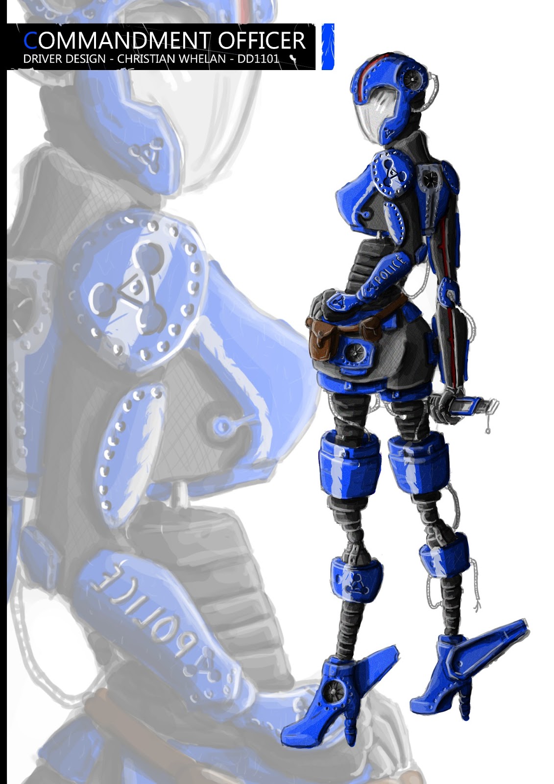
         Long overdue blog post. But after developing the original silhouette designs for the vehicles, I asked friends and family which of the designs they preferred. Surprisingly, they chose the one I preferred, but the one I didn't think anyone would of liked. So fortunately for me I began to design that silhouette.

     Now, this vehicle was inspired by an early 40's car with the idea that when developed, it would be extremely patriotic in design (flags, american colours etc) and the driver would be am androgynous female american hero figure. However, as I started to develop the idea, I realised, that although it looked functional, it just wasn't an interesting. The top down view, of which I began with, inspired a new idea - a intimidating dragonfly design.

     However, this would render my patriotic concept useless. So, as I developed the vehicle I started to see a dragonfly and an eagle within the same silhouette. From that point, I had in mind a vertical police force vehicle (it's intimidating and patriotic) - one which can switch between a close quarters upright hover craft and a normal fighter jet. 


Note: the design below is it's upright position.

     With this police force idea in mind, the colours blue, white and red came to me (naturally), but considering its futuristic look, I decided to go with the robotic look which in turn, inspired the driver - a mass produced law enforcer that shared the same visual and physical characteristics as it's vehicle.

     In all, I'm really happy with the vehicle and character  I think the concept itself could be a little clearer on its orientation, but other than that, I like the concept behind it and the designs execution. I still have a lot of room to improve though. I'm trying.


COMMENTS AND CRITICISMS APPRECIATED!

THE ODREAGLE - VEHICLE DESIGN
by Christian Whelan
THE COMMANDMENT OFFICER - CHARACTER DESIGN
By Christian Whelan

       My next goals are to really plan out characters before I design them. I seem to just go with the flow when it comes to characters, resulting in a mixed bag that's just above average for the level I should be at. When vehicle designs are considered, I need to learn perspective because to be perfectly honest, the only reason there isn't a perspective view of the vehicle, is because I was too intimidated by the idea. Maybe next time.
    
 Most importantly, I need to practice at grey scaling, I've seen other student's vehicle designs and you can really see the jump in quality when it's used effectively to develop shape. Again, next time.

NEXT POST: TASK 10 - LANDSCAPE CONCEPT - PROGRESS 01/03/2013

Thursday, 14 February 2013

TASK 9: FINAL VEHICLE SILHOUETTES

       Spent the last hour conjuring up some mindless silhouettes and developing them into inspired vehicle designs. So far I'm absolutely chuffed with the results, I've even started brainstorming some functionality ideas and even accompanying characters. Yes, a couple of the silhouettes are laughably horrific (the flying bird killing machine), but have a look at them anyway.


COMMENTS AND CRITICISMS APPRECIATED!

VEHICLE SILHOUETTES / DESIGNS
by Christian Whelan

     I tried my best to come up with a wide variety of ideas here, and as it turned out, most of them are inspired by some form of animal or insect. To me, this allows for some really wacky characters designs for the drivers that have to go along with the final vehicle. 
  
     My absolute favourite is hard to decide upon. My 'favourites' are the top right mole design, which is a cross between a bike, a tank and a construction vehicle; the top right fly inspired aircraft; the bottom right spider inspired chopper; the bottom left space ship inspired by a dolphin; the left hover drone and finally, the top left hovering 360 combat ball. So really, its a question of what I don't like (I tend to like my own stuff...).

I'll attend university tomorrow and get some further criticism or praise and make a judgment on that. It's really a question of which is the vehicle that is the most interesting, but the most plausible (at least that's what I believe). Of course, the character who drives it is also an important factor, but that can come afterwards.

NEXT POST: TASK 9: VEHICLE AND DRIVER DESIGNS

Sunday, 10 February 2013

TASK 9: INITIAL VEHICLE IDEAS

     Never, have I drawn a vehicle in my life. Unless you count the firetrucks I designed when i was 3 years old, I can't say I'm that experienced. So, considering my next challenge is to design a selection of vehicles and choose one to polish, I can imagine this is going to be the hardest. So hard in fact, I had a 3 hour mind block and only came up with the basic (very basic) designs below.


VEHICLE DESIGNS - BASIC
by Christian Whelan

      Surprisingly, I only designs that use references, are the large construction vehicle and the red hover craft. The construction vehicle was inspired by a monster truck and a spider (Yes, I know it doesn't look like a spider, but it hasn't been finished) and the hovercraft was inspired by a the 40's vehicle (by the way, its backwards, because that how the shape came out).

These where drawn with my mind block not my mind, after 3 hours, I overcame it, and developed the rest of the design in the last 5 minutes. Funnily enough, these are my favourite. Generated through random shape blocking, I think they are varied, interesting and most importantly, really quick! I can't wait to get a few more ideas down!

NEXT POST: TASK 9: FINAL VEHICLE SILHOUETTES

TASK 8: WEAPON AND ARMOUR DESIGN (HAND-IN)

      It took me a good few hours, but I finally got the weapons and armour design done. The task was to design a set of weapons and armour to match as a theme. It was probably the hardest task yet, but through it, I think I came out with something really good. Have a look at them both below!

COMMENTS AND CRITICISM APPRECIATED!

FUTURISTIC ASSASSIN - ARMOUR DESIGN
by Christian Whelan

     So both poses are done and the armour for both is consistent besides one thing - the 8 pack. Once again, I forgot to polish it up. Regardless of that, I think this is my best piece. In terms of proportion, colouring and lighting, I've come a long way since my first drawings, and I believe this is largely due to relying less on line art. The weapons are a more accurate exhibition of my current ability.

FUTURISTIC ASSASSIN - WEAPON DESIGNS
by Christian Whelan

     When you look at my initial designs for the weapons, you'll see how they've changed. I've completely abandoned the wood theme - the only referenced and researched part of the weapons came from armour. Considering the weapons are supposed to blend seamlessly with the armour, this seemed appropriate, and I think it was effective. Of course one of the weapons clearly isn't hidden, even so, it's design suits the concept of the armour.

     Overall I love each of the weapons, they all have their unique visual features and firing styles whilst all working with the armour's design seamlessly. The Observant is the quick fire weapon, The Scatterer is the fully automatic precise weapon, The Repeller is the precise defense weapon, The Judge is the heavy room clearing weapon and The Revenant is the last resort destruction defense - all whilst working together and with the armour so they are one, rather than separate.

     Visually, My favourite of the weapons are the Observant and The Judge. The Observant looks great. It really integrates with the armour and I think I did a good job reflecting it's textures and shape. However, the Judge is by far the best of the weapons (as many people who have seen it agreed), maybe its because it is inspired by and references a real weapon, which was one of my concerns when designing's the others, but to be honest, I think it's just because it looks bad ass! The detailing of the rivets and metal texture in contrast to the futuristic red really work, and the way it holsters on the shoulder blade with its collapsing scaffold, I believe, is a really cool idea.

       Now this is done, my goal is to continue on as I have been doing, relying more on lighting to define shape and to texture parts to increase quality. But there are still things I need work on. Firstly I need to improve on faces, hands and feet. Whilst doing so, I need to start utilizing complimentary colours. once I've practiced and perfected these, its just a matter of developing my drawing skills in general.

NEXT POST: TASK 9: VEHICLE IDEAS

Thursday, 7 February 2013

TASK 8: WEAPONS AND ARMOUR (IN PROGRESS 3)

      I spent the last 6 hours blocking and lighting the hands of the first pose, but most importantly I started and 'almost' finished the second pose. I say almost because I still need to polish up the smaller details such as the bolts and rivets on the armour plates. Have a look anyway.


COMMENTS AND CRITICISMS APPRECIATED!

FUTURISTIC ASSASSIN ARMOUR DESIGN - IN PROGRESS
by Christian Whelan
FUTURISTIC ASSASSIN ARMOUR DESIGN - GIF
by Christian Whelan

      Once this is done, it's just a matter of redesigning and polishing the weapons, then finally, implementing the weapons into these armour designs an detailing their functions and weapon type.

Overall, I'm really happy with the outcome, I tried my best to stay away from line art, but as you can see, there is still some there, but I don't mind, because it stops the colour of the armour blending into the background. I suppose that wouldn't be the case if I was a little better at rendering and lighting.

On a less positive note, there are some clear issues and inconsistencies in the armour. Firstly, the sitting pose has an 8 pack... Also the foot and hands are the problem. I definitely need more practice when it comes to proportion and perspective on more complex body parts like the hands and feet.

Other than that, It's 'probably' the best piece I've done so far. I'll have no problem designing the weapons now.

NEXT POST: WEAPONS AND ARMOUR (HAND-IN)

Sunday, 3 February 2013

TASK 8: WEAPONS AND ARMOUR (IN PROGRESS 2)

    I spent the last hour making progress on the final hand-in of the armour and weapon designs. I've only just come close to finishing the first pose but have a look at it anyway. I think it's coming along really well!

COMMENTS AND CRITICISMS APPRECIATED!

FUTURISTIC NINJA ARMOUR - IN PROGRESS
by Christian Whelan
      
     So far I think this is my best piece. I no longer rely on bold line art to portray a character's shape and perspective.  This is something that I've been aiming to do since I started this course. For me, at least, line art seems to enforce a restriction - everything I draw, no matter how much I render it, looks too two dimensional. Maybe it's just my ability to render that's the issue, but through abandoning my usual line art ways, I hope to improve my rendering and lighting skills in the process, giving my freedom to use line art when I want, effectively.

The idea finish the gloves, implement the weapons into the armour and start the second pose. The second pose will not be the one in the picture, I hope to have a crouched 'assassin like' pose that exposes the back - a three quarter view. This way I can highlight all the weapons in detail. 

Finally, I'll draw in the weapons around the two poses individually, highlighting their titles and functions.

NEXT POST: TASK 8: WEAPONS AND ARMOUR (IN PROGRESS 2)

Saturday, 2 February 2013

TASK 8: WEAPON AND ARMOUR DESIGN (ARMOUR IDEAS)

         With a little needed criticism, it turns out my initial designs for the armour where lacking a little  So, as a result, I decided to add some ideas to the armour (unfinished ideas at that) and then implement the weapons into that armour to get an idea of the structure and colour scheme of the armour. Below is a posh gif and some full sized images to have a gander at.


COMMENTS AND CRITICISMS APPRECIATED!

WEAPON AND ARMOUR DESIGNS GIF
By Christian Whelan
ARMOUR ADDITIONS
By Christian Whelan
WEAPON IMPLEMENTATION
By Christian Whelan

     The new additions and style of the armour where inspired by Misamune Shirow art in Ghost of the Shell. His modular mech armour designs are that little addition that fill out the lacking areas on the original armour. Granted, its a little rough but you can get the idea.

As for the weapons, they were already designed in a way to work with the armour. But with the black colour scheme, they really work. So far, I'm really in love with this design. All I need to do now is finish off the legs armour and develop the final hand-in piece.

NEXT POST: REFERENCING PRACTICE

TASK 8: WEAPON AND ARMOUR DESIGN (WEAPONS IN PROGRESS)

          Now that the initial design ideas for the armour had been completed, I had to start designing some thematic weapons to go along with it. Now, as mentioned before, the idea is that the character who wears the armour has as little contact with his foes as possible. With this in mind, the weapons below where designed.

COMMENTS AND CRITICISMS APPRECIATED!

WEAPON DESIGNS - FUTURISTIC ASSASSIN
by Christian Whelan

The ideas aren't really finished, largely due to a mind block brought on from constant comparisons to other games and films. These comparison, made by others, are completely unintentional, I just designed what I thought fitted the armours theme, which also happened to receive a few (a lot) of comparisons. Again, unintentional on my part.

So, I needed to design a Light Weapon, a Standard Weapon, a Heavy Weapon and a Concealed Weapon. All of these needed to connected to one of the many power sources on the armour.

The Light weapon is the helmet that as a result trying to implement a musketeer theme into the futuristic armour, ended up with muskets on his head. I liked the design, but it didn't seem practical, as one of my friends said "The recoil on his head must be a problem...". That, along with the my tutor sharing the same feelings have prompted me to rethink this design (maybe even abandon the wooden look altogether).

The Standard weapon is the arm cannon - a rapid firing brace. Compared to Dead Space for its spine like appearance its a design I intend to keep on the most part, but maybe refine it, as it was my first idea once I finished the armour designs.

The heavy weapons - there are two (both could be considered concealed). First, the arm mini-gun. Again, it has a comparison - Predator. Not what I had in mind (again), but I like that idea, the Predator was an assassin of some sorts, so it works, especially when the armour is futuristic. However, my tutor told me to embrace the idea of a shoulder mini gun, one that flipped up when in use would be more fitting ("cooler"), and more practical. It was a concern I shared, so from this point, that the design I'll go for.

     Secondly there is the area blast (the waist power point). The idea is to have the power sources (the ones not in use) emit a large area blast. I love this idea, its simple and unique (I hope) - I'm sure someone will have a comparison somewhere. A note to make, is that it's damaging effect is only as great as the number of power outputs not in use. So if you want to fit yourself with an arsenal of bodily weapons, then you'll just have to make do with a lame area blast.

For the concealed weapon, I have the glove. This will emit an energy that repels all foes away from him / her. Again, this is only as powerful as the energy it has, so if all the power outputs are taken, it's not the greatest or weapons. Initially, I went for the hidden dagger, but that didn't make sense considering the lack of physical contact (and the comparisons to Assassins Creed). So I went for the glove (which ended being compared to Iron Man... brilliant.)

Now, I just need to refine the weapon designs, the armour designs and fit the weapons onto the armour. They may all have a comparisons, but to be honest, all the comparisons are pretty amazing, so I'm happy.

NEXT POST: TASK 8: WEAPON AND ARMOUR DESIGN (ARMOUR IDEAS)

Sunday, 27 January 2013

TASK 8: WEAPON AND ARMOUR DESIGN (ARMOUR IN PROGRESS)

        Recently, I went to the Leeds Royal Armoury to research and reference weapons and armour from various eras in order to inspire my next assignment - to design and develop weapons and armour for a character.

The below in progress sketch is an idea resultant from hours of mind block and inspiration - an electrically  charged (or some form of power source) assassin .


Right now, I'm still trying to find a direction for this design. Do I keep it basic? Or do I go for a culturally inspired design like Dishonoured or Assassins Creed have done? The design on the right was an attempt at implementing an musketeers outfit into the design. I like it, but its far from finished.

The idea for the character, and therefore the armour, is as follow: 

With only bodily firearm attachments, this mercenary assassin performs martial arts in order to fight through enemies close up or from afar, the twist, is that he never touches his enemies. He kicks, punches and moves through and past his enemies, but just before he makes contact with his punches, kicks or grabs, his firearm bodily attachments fire, removing any need for physical contact.

With no real inspiration besides the human figure, this armour contains one of the weapons, a devastating area blast that digitalises all enemies. This weapon fires from one of the many limb assigned red dots (power outputs) around his body. Other weapons are yet to be designed, but a few ideas run through my head.

HAND-GUN: A mechanical spine runs from the wrist to the shoulder, resting under the cape that is tapped to fire from the wrist. 

HIDDEN BLADE: Hidden underneath the cape on his shoulder, the hidden blade never touches an enemy - it fires a blade shaped beam at the enemies. In addition, it can be equipped whilst firing the handgun, as they are located in the same hidden place under the cape.

I'm still brainstorming some ideas at the moment, the next blog post should cover the weapons and any developments in the armour design.

NEXT POST: TASK 8: WEAPON AND ARMOUR DESIGN (WEAPONS IN PROGRESS)

TASK 7: SEA OF GHOSTS IANTHE (FINAL DESIGN)

         I spent the last 2 weeks coming up with a few designs for the character of Ianthe from Sea of Ghosts - a book from the Gravedigger Chronicles. After finishing the book and compiling a list of character notes, I noticed she had two main appearances in the book - a slave peasant and the well dressed Unmar girl. 

After coming up with a few designs for both appearances, it seemed to me Ianthe as a slave peasant seemed more appealing as a character visually, I think it represented her character more affectively - the worn down girl who's had the worst of days. The final design is below.


This was by far, my favourite design, so I chose it. Why? Well, it was the most faithful, yet most creative, extravagant and interesting design of them all. Everything, the pose, the face, the clothes, the accessories, they all reflect Ianthe perfectly in my eyes, whilst proving a design that doesn't conform to the expected.

However, I did change the design slightly. My other favourite design of the peasant wear sketches was the one that was the most basic (the far left peasant design). So, to break things up, I decided to add some loose cloth that connected the chest and the waist. I regret this decision greatly, it ended up making the design less interesting as a result - easily changed though!

In all, I'm over the moon with the final design of Ianthe. Although there's some room for improvement in the design and when my drawing skills are in question, I believe it came out to the best of my ability. Things I need to improve on with my drawing? Cartoon like faces, Hobbit feet and thin Golem hands. Although, I believe I've come a long way since my first drawing!

NEXT POST: TASK 8: WEAPON AND ARMOUR DESIGN (ARMOUR)

TASK 7: SEA OF GHOSTS IANTHE (ROUGH SKETCHES)

       Below are the initial sketches/ ideas of the character given to me by my tutor. The character Ianthe from Sea of Ghosts (part of the Gravedigger Chronicles) has two states during the book - a slave girl and a well dressed Unmar girl

    To ensure that the final design is successful, I explored both ideas in order to develop a comprehensive knowledge of Ianthe. Details such as the clothing, the face and the accessories were all explored in order to make an informed decision as to which design to polish for the final concept. The initial sketches are below.


DRESS (1 and 3): Both the left and right dress adopt a more extravagant theme. It appears almost magical and in both, Ianthe looks elegant and beautiful. I like the complexity of these dresses and how they reflect the fantastical atmosphere of the book, but the characters themselves don't reflect Ianthe as a character very well. However, out of the two designs, the right hand dress is my favourite. If I was to design one of these, it would be that one for sure - I love it.

DRESS (2): Here, I took the details from the book and nothing else, then designed the dress. What is left, is a basic but faithful representation of Ianthe. However, to me, it completely lacks any interesting characteristics. One thing I will highlight as a positive though, is how Ianthe has a shackle on her left arm. That is a detail I would definitely keep.

PEASANT WEAR (1): This design is inspired by the exact details given from the book. However, these details weren't that specific. Although basic and stereotypical, this design, I believe, is effective. In addition, her figure and posture reflect her elegance and slender physical appearance mentioned in the book. A key design aspect is that her torn clothes loosely hag over her breasts. However, although effective, she appears too old here.

PEASANT WEAR (2): Retaining the same materials and colours mentioned in the book, this design is a bit more creative - she wears a torn overcoat this time and her hair is more intimidating. The idea was to design something a little more interesting and reflect Ianthe's independence and assertiveness. Again, her clothes loosely hag over her breasts.

PEASANT WEAR (3): My least favourite of the designs. However, the idea was to stray away from the details in the book, changing the grey to white for a more realistic take on peasant wear. In addition, she also hold the Unmar crystal.

PEASANT WEAR (4): The most extravagant idea, whilst still staying faithful to the book. Here, Ianthe is thin, young, intimidating, yet weak. All of the details mentioned in the book have been considered here but what I like about this design, is how is it strays from the expected, resulting in the most interesting design of them all - a personal favourite of mine.

FACE (1): Although never mentioned in the book, this design is more beaten and worn down to reflect her current state. This, I assume, would be the face used if I was to concept Ianthe in the peasant wear rather than the dress. As a further note, her facial expression, along with the bruises and cuts, reflect a more aggressive Ianthe. Again, more suited to when she wore peasant wear.

FACE (2): A younger, kinder face. The idea here was to reflect her youth and elegance she is often described with. A combination of this and the first face for the final concept?

UNMAR SPECTACLES: A key part of the story, the spectacles have a more magical look than the costumes. I implemented the mechanical dials as well as the extravagant colours of the world Alan Campbell created. The idea was to have a contrast between the clothing and the spectacles. 

SHACKLES: These are basic, stereotypical shackles. The only design choice here is the colour. I opted from a rusted iron look to convey to atmosphere of the Granger's jail.


Now all I need to do it choose a design and polish it up!


NEXT POST: TASK 7: SEA OF GHOSTS IANTHE (FINAL DESIGN)