Total Pageviews

Showing posts with label Concept Art. Show all posts

Thursday, 11 April 2013

STYLE MIXING: THE THREE STYLES

     Finally, after 7 hours of work, I finished all three style mimicry pieces for Sean Galloway, Ashley Wood and Marek Okon. My intention was to design an anti-hero mafia character. In that sense, I succeeded, and I absolutely love this character - I actually feel like it's a 'character'. Whether or not I succeed in replicating the three styles is yet to be determined. What I can say though, is that I tried my best, even if there are some flaws. Have a look at all three below!

STYLE MIXING: SEAN GALLOWAY
by Christian Whelan
STYLE MIXING: ASHLEY WOOD
by Christian Whelan
STYLE MIXING: MAREK OKON
by Christian Whelan

       In all, this assignment actually surprised me in how much it actually developed my skills, pushed my ability further and expanded my artistic horizons. I feel that here, I've developed my three most consistent pieces that exhibit the majority of my capabilities. Maybe if I'd had more time, I would of developed a backdrop for the Ashley Wood piece to demonstrate my understanding of perspective and the use of multiple complex lighting sources, but I understand this is just a study to do exactly what it did do - push me out of my comfort zone and in turn, develop my ability when using Photoshop. I thoroughly enjoyed this assignment.

NEXT POST: 10 PIECE PORTFOLIO

STYLE MIXING: MAREK OKON (COMPLETE)

      I've finally finished the Marek Okon piece, but when I say finished, I mean finished to the best of my ability within the time I have. I am so far, extremely proud of this, but I want it to finish 'realistic'. So, even though I'm happy with the overall result, I will 'definitely' work on this until I'm satisfied. The final Marek Okon mimicry piece is below.

STYLE MIXING: MAREK OKON
by Christian WHelan

     Like I said, it needs improving. The next step to take is to rid the piece of the clear contrasts in the shading - it still looks too choppy. Then from that point, remove all the random blotches of dark shading that make his face look dirty and the entire piece look cheap. Then once all that is done, I can take the entire piece further by refining the skin and facial details, bringing the entire piece up a level. A level I wished I could of took it to in the first place.

Regardless of these clear improvements I can make, this is still the best face I've painted as of yet. Here's for next year!

NEXT POST: STYLE MIXING: THE THREE STYLES

STYLE MIXING: SEAN GALLOWAY (COMPLETE)

      Refining the lines of this piece turned out to be a harder challenge than the other two pieces put together. The thing is, when you have an image of a million parts, the quality of them parts can differ, but with a piece of few parts like Sean Galloway's work, the individual aspects have to be top quality. So when drawing the lines, everything had to run smoothly and connect precisely, otherwise it just turns out looking like a mess.

The most challenging part for me however, was restraining from putting in more detail. Already, there may be a little too much detail, but I think I kept it at a sensible level. Now, it's finished and the final result and development GIF are below.

STYLE MIXING: SEAN GALLOWAY
by Christian Whelan
STYLE MIXING: SEAN GALLOWAY DEVELOPMENT
by Christian Whelan

      A couple of things really could do with some improving now I look at it. Firstly, the weapon is absolutely terrible, I'd get rid of it but time isn't on my side. And secondly, there's something wrong with the face... I can't put my finger on it yet.

    The challenging parts aide, I really enjoyed this piece. It's quite liberating being allowed to exaggerated proportion. It's not a style I'd try everyday, but it's interesting to see how a mature and realistic character can become something really fun - being able to represent character in different ways really interests me.

NEXT POST: STYLE MIXING: MAREK OKON (COMPLETE)

STYLE MIXING: SEAN GALLOWAY PROGRESS 24/03/13

        Now that the Ashley Wood piece is done and the Marek Okon is yet to be completed, I thought I'd attempt Sean Galloway's work to give me a breather from ultra realistic attempts. The trick with this work is nailing the exaggerated proportions to create a really stylized piece. It all sounds simple when you're drawing Spider Man or some goofy skateboarder, but with a character like mine that is meant to be serious and mature, it is and was a challenge. Either way, my progress on this piece is below.

STYLE MIXING: SEAN GALLOWAY (IN PROGRESS)
by Christian Whelan

       So far, I've only put in the line art, which, for a Sean Galloway piece, is incredibly important. If I nail this, I've nailed the entire piece. In my personally opinion, I've think I've done a good job. The character looks a little younger than the other two style variations, and the gun and feet could be a little better, but once polished up, it should be fine. I could then put in the colors, the shadows and then I'm done.

NEXT POST: STYLE MIXING: SEAN GALLOWAY (COMPLETE)

STYLE MIXING: ASHLEY WOOD (COMPLETE)

     Figuring out how to use the brushes without damaging the work was a challenge, but I managed it to some extent. I'm not entirely happy with the outcome, I think there's a lot of room for improvement, but considering the time and environment I currently have, I think it turned out great. Not only that, but I like the character itself.

STYLE MIXING: ASHLEY WOOD MIMIC
by Christian Whelan
STYLE MIXING: ASHLEY WOOD DEVELOPMENT
by Christian Whelan

    Personally, I think this is my best full body art so far, when you consider what my work was like at the beginning of this year, I personally think I've come a long way in almost every sense. As a final note, I only realized after I had finished the piece, that I forgot the finish the feet, hence the terrible stumps. I've saved multiple copies at various stages of it's development  so it's something I can work on at a later stage. For now, I'm happy to say I've finished it. Next is the Sean Galloway piece, before finally, finishing the Marek Okon work (which is daunting).

NEXT POST: STYLE MIXING: SEAN GALLOWAY PROGRESS 24/03/13

STYLE MIXING: ASHLEY WOOD PROGRESS 23/03/2013 (UPDATE 2)

     I finally started added the brush strokes in. Browsing the internet, I found two brush sets that I liked (the ones that are free...) and with them, I started to slowly build it some brush strokes and added in a background and a floor to add some much needed depth to the picture - plus, it just looks cool.

STYLE MIXING: ASHLEY WOOD (IN PROGRESS)
by Christian WHelan

      It's not done yet. Ashley Wood's work is very impressionistic, so to achieve that style, I need to add in some bolder, sporadic brushes into the actual character himself. At the moment, too much of the previous version is showing through. Hopefully, within the next half an hour, I should have this piece done, polished and presented. I'm chuffed with it so far.

NEXT POST: STYLE MIXING: ASHLEY WOOD (COMPLETE)

STYLE MIXING: ASHLEY WOOD PROGRESS 23/03/2013 (UPDATE)

      Another hour and I've pretty much got the character down. It's been easier than I expected to be honest, I'm just kind of going with the flow. Now, I know I said I wasn't putting much detail in, but I lost track of my goals and time and ended up doing anyway. I may have screwed myself over here but I'm yet to find how it looks when I add on the brush strokes.

I'm such an idiot!


STYLE MIXING: ASHLEY WOOD (IN PROGRESS)
by Christian Whelan
STYLE MIXING: ASHLEY WOOD DEVELOPMENT
by Christian Whelan

      I think now is a good time to start adding the brush strokes and a basic (and I mean basic!) backdrop. With that, I may put a top hat on the floor to develop the perspective and make the pose more interesting.

NEXT POST: ASHLEY WOOD: PROGRESS 23/03/2013 (UPDATE 2)

STYLE MIXING: ASHLEY WOOD PROGRESS 23/03/2013

      30 minutes later, and I've got a very basic model down for the Ashley Woods piece. Obviously there's a lot more work to be done, but from this foundation I can begin to refine the details, add in detailed highlights and mess with the contrast to match the head. Once I've got that down (Note: I'm not going to go mental on the detail) I can start adding the Ashley Wood flavor into it. Hopefully I'll have this done within the next couple of hours


STYLE MIXING: ASHLEY WOOD (IN PROGRESS)
by Christian Whelan

     There's something not quiet right with this though. I think it's the head, but that can be edited later. Right now, I'm worried about getting the important information down so that when I add the brush strokes in, they come through.


STYLE MIXING: ASHLEY WOOD (SKELETON)
by Christian Whelan

I've seriously smashed this out of nowhere. I'm not being anal about everything, in fact, I don't even think I'm thinking... 

Deadlines....

NEXT POST: STYLE MIXING: ASHLEY WOOD PROGRESS 23/03/2013 (UPDATE)

STYLE MIXING: MAREK OKON PROGRESS 22/03/2013

       I made some more progress on the Marek Okon work, but I'm hitting a roadblock - do I carry on or leave it as it is and present it? To me, it looks more like an Ashley Wood piece (besides any clear paint brush strokes) than a Marek Okon piece. It's just way too 'choppy' at the moment.... I don't know. Other work commitments are kind of forcing my hands with this at the moment. 

STYLE MIXING: MAREK OKON ATTEMPT
by Christian Whelan

    Don't get me wrong, I'm really liking it, it's my best face work so far. I tried blurring the clear color differences together, but it ended up looking... well... blurry. I'm thinking of maybe starting the Ashley Wood work now and coming back to this when I have a clear head - maybe I've been looking at it too much. One thing that is certain though, is that I need to work on this clothing a bit more, it's need's more detail to bring the entire piece together.

Oh, and the eyes need to be a tiny bit lighter - he looks high.


I suppose it's a lot better when you look at my first attempt. God it's awful!

FIRST MAREK OKON ATTEMPT
by Christian Whelan (Unfortunately)

We'll see how it goes.

NEXT POST: STYLE MIXING: ASHLEY WOOD PROGRESS 23/03/2013

Tuesday, 9 April 2013

STYLE MIXING: MAREK OKON PROGRESS 21/03/2013

         Unfortunately, other course commitments have pushed back further development of my Marek Okan work. It seems like forever since I last held a digital pen and it was showing through initially. Not only that, but the drivers for my Wacom tablet are having a fit, so the pressure sensitive features and calibration are off. I've tried downloading the recent driver(s) but it just isn't having it: maybe it's the tablet itself. I hope not.

   Anyhow, today I started the daunting task of adding in the eyes, ears and hair. The eyes are complete (aside from some more refining), the hair is slowly coming along and the ears are being stubborn, and now I don't have a Marek Okon tutorial at hand, it's proving quiet a challenge getting this done.


MAREK OKON STYLE - PROGRESS GIF
by Christian Whelan
MAREK OKON STYLE - IN PROGRESS
by Christian Whelan

     At first, I started by adding in the basic lighting for where the eyes would sit, then I added in the highlights to get the shape of the eyes and flesh around them (over a basic eye colors). From this point, I could refine the eye, adding in the color and shine until eventually, adding in the darker shadows so they didn't seem to 'flat'.

     The ear however, is much, much, much harder - harder than I expected actually. The shape of an ear is incredibly complex, especially when you consider the lighting and lighting source(s). It's an absolute nightmare and clearly still in progress - it's extremely rough at the moment.


The hair is turning out a lot better than I expected. I've never really tried hair because of it's specific complexity and awkward co-operation with the light. The hard part now, is refraining from making it too complex and adding in the highlights without them becoming foreign to the whole piece.
    When I had the tutorial, my initial progress took me half an hour, this however, has taken me 2 hours. It's not easy trying to paint a realistic portrait of a human using only your imagination. The only thing guiding me in this work now is family feedback and trial and error, I guess that the beauty of digital painting.

NEXT POST: STYLE MIXING: MAREK OKON PROGRESS 22/03/2013

Saturday, 16 March 2013

STYLE MIXING: MAREK OKON PROGRESS 15/03/2013

       The great thing about designing a Mafia-esque character is that the clothing isn't the focus, as their clothing is generally simple and stereotypical - I don't have to reinvent the wheel. The importance is in the face, so considering this will be the defining feature of all three styles, I decided to start with Marek Okon's ultra realistic style, as our tutor advices we simply use a close-up shot (shoulders and face) when adopting his style. 

     This allows me to do two things - one, get the hardest style out of the way whilst developing my Photoshop painting skills further, and two, it allows me to develop the character in the characters face, which just happens to be the most important and defining characteristic of this character design. It's the logical choice to start with Marek Okon's painting style - it suits my approach.

So I started adopting Marek's style today, and so far, it's turning out pretty well (directly below). This is not to say I didn't have my failed attempts along the way (bottom two images).


CHARACTER DESIGN - IN PROGRESS
by Christian Whelan

      Something that I should note is that I'll paint in the eyes, ears and hair last. By lighting and rendering the head first, I can get an idea of how to light the eyes (the hardest part of the face) realistically. At the moment, I'm really liking my progress, it's the best portrait I've done so far and I'm learning quiet a lot on how colours work with each other and how to choose a pallet and stick with it. No more white and blacks for me!

I thought it was turning out well, but there was something wrong with the face I couldn't initially put my finger on, I soon realised it was nose and the eyes. They made the character look inhuman. Looking at the .GIF below, you can see how I used the warp tool to save myself some time by repositioning the nose.


CHARACTER DESIGN - IN PROGRESS GIF
by Christian Whelan

      Again, the .GIF file is being temperamental (I really need to sort that out), but you get the idea. Anyhow, as I said, there were a couple of failed attempts that were still useful in letting me find my creative feet. 


CHARACTER ATTEMPT #1
CHARACTER ATTEMPT # 2

     Not much to say here really. The first attempt is terrible and reminiscent of the art I did at the beginning of the year and the second one was turning out okay I suppose, it let me understand the structure of the face a litter better, but again, it was just too childish.

So I got the latest attempt done in 45 minutes, and I am to carry on with it. I need to finish the lighting, the clothes, the lips, the eyes, the ears, the hair and the background. Once done, I think it'll look quiet nice.

NEXT POST: STYLE MIXING: MAREK OKON PROGRESS 21/03/2013

Friday, 15 March 2013

STYLE MIXING: CHARACTER STYLE REFERENCES

       For the chraacter that will form the basis for all three styles, I want to strive for an late twenties to early thirties mafia look. In this case, the fashion from that era aswell as pop culture will be a good reference point. Currently, I picture an well built male character with a tight (slighlty unbuttoned) off-white shirt, a black waistcoat, black pants, holding a tompson at his side. Maybe I could swap this black and white pallete for a grey or brown - it all depends on what era I choose as a basis for the fashion.

Either eway, I've gathered some material online that I think will prove usefull when designing the character.

Fashion, iconic people, pop culture that created the Mafia stereotype such as The Godfather and even modern medias such as Mafia 2, will basis of this template chracter. Notable reference images are below.

THE GODFATHER - AL PACINO
WAISCOAT AND COLOURS
RANDOM MAFIA DUDE - 1930's
POSE, WAISTCOAT AND TOP HOT
MAFIA II - VITO
CHARACTER, POSE, COLOURS AND CLOTHING

MAFIA II - VITO
HAIRSTYLE, CLOTHING AND THEME

Now I have a basic idea of the character I want to design, I can begin adopting the three defferent art styles.

NEXT POST: STYLE MIXING - MAREK OKON PROGRESS 15/03/2013

Sunday, 10 March 2013

STYLE MIXING: THE BRIEF

         The latest task of the semester was set recently - to design a character and draw him / her three times, adopting three distinctly different art styles. The art styles off Sean Galloway, Ashley Wood and Marek Okon. An example of each of there work is below. They're pretty cool.

SEAN GALLOWAY - EXAMPLE WORK


    Sean Galloways work doesn't really appeal to me. Not that there's anything wrong with his style, but its too basic for my liking - very 50's comic like. However, it seems like a simple style to replicate (famous last words) - thin lines, basic lighting and exaggerated physical features and poses. It kind of remind me of Jet et Radio, Dragon ball Z or the Gorillas.

ASHLEY WOOD - EXAMPLE WORK


     There's something very Metal Gear about this artwork (one of my favourite games), and looking at other Ashley Wood pieces, I can imagine I'll enjoy mimicking her style. It's realistic yet conceptual - an aspect of her work I really like.

MAREK OKONS - EXAMPLE WORK


Marek Okons work is pretty intimidating - clearly the most challenging out of the three. Although I think his style is phenomenal (Mass Effect like... and that game is amazing!) it's going to push my talents to the limit! I think I'll attempt this one last...

        Clearly this task is going to force me out of my comfort zone, but considering I've already took that first step with my environment concept, I think I'm prepared  At the very least, it's going to develop my creative versatility when it comes to add. Thank god, because I was getting sick of using the same style over and over again. 

NEXT POST: STYLE MIXING - CHARACTER STYLE REFERENCES

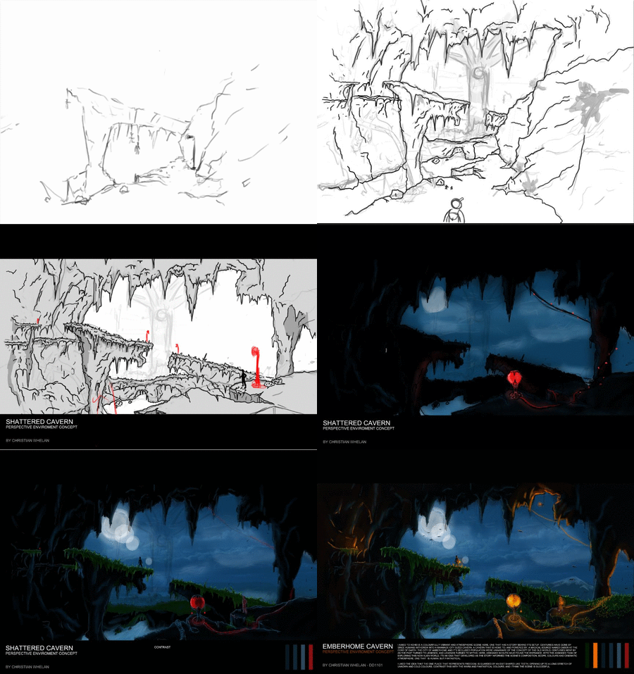
LANDSCAPE CONCEPT (HAND-IN)

      This is by far my favourite task and piece for university that I've worked on. If I had to choose, environment art is definitely a route I'd like to explore further. I feel I could, and can, improve on my talents in this area - I really want to. Not that character or vehicle design bores me, it's just I like the idea of having an entire canvas to freely work on - the entire scene can become a character itself, and I love that.

After another hour of work, I finally finished my environment concept. It could still be improved, but I have no idea how to move forward with that - I need my tutor's criticism and advice. Regardless, I think I've done a good job and as I say, it's my favourite piece. Both it and I have come a long way since its basic line drawing, and I'm glad it changed the way it did. 

Have a look at the development .GIF below and the of course, the final concept.

COMMENTS AND CRITICISMS APPRECIATED!

CAVERN ENVIRONMENT CONCEPT - DEVELOPMENT .GIF
By Christian Whelan
CAVERN ENVIRONMENT CONCEPT
by Christian Whelan

    Don't get me wrong, it could be better. The foliage could be less cartoon like, the highlights could be more effective and the foreground could have a little more character and detail. However  compared to my usual standard of work, I think I've improved, and if there are any inconsistencies, I'm sure my tutor will highlight them so I can improve for future art.

I literally cannot wait to get this printed off on glossy paper. It's gonna look sexual. Yeayuh!

NEXT POST: STYLE MIXING: THE BRIEF

LANDSCAPE CONCEPT - PROGRESS 04/03/2013

        Spent a couple of hours refining some of the textures and making a drastic change with the colour palette. Rather than red, I opted for orange as a second lighting source. I don't know why I didn't think of this earlier, orange contrasts and compliments blue (the base colour for the scene). Red just doesn't fit in this vibrant scene any more. Finally, I've managed to capture some form of fantasy like atmosphere.

CAVERN ENVIRONMENT - IN PROGRESS
by Christian Whelan
 
Again, it's not finished, some of the lighting was placed to get an idea of its final positioning. I aim to carry this theme throughout the entire scene and add in some stalactite geometry (maybe?) to add depth and help define the lighting.

    A couple of additions have been made. I refined the grass texture, added in some vines (I hope to add in some moss), some water spray, water texture, further highlights and some bats on the horizon and within the cave. The bats will be great tool when coming to defining the scale of the scene with lighting.

    The idea was to have people residing within the cave, banished from a hostile world. There only methods of light is ember magic, the source of which was found within the cavern and harnessed when civilisation was forced to move underground. This scene captures their determination to venture outwards and far. 


It's just a case of adding in elements and refining everything within the scene now to ensure it's consistent and effective. Hopefully, by tomorrow, it should be done. There's no reason why it shouldn't be.


NEXT POST: LANDSCAPE CONCEPT (HAND-IN)

Saturday, 9 March 2013

LANDSCAPE CONCEPT - PROGRESS 03/03/2013

         Not had much time today to make any progress on my environment concept, but I made some progress that has given me ideas on how to progress with this work. With my last progress update, I'd adopted a new style and direction and had a light attempt at executing it. Today, after two hours of work (whilst watching Scarface) I added in the sky, further lighting and highlights, a character silhouette, a moon, a second lighting source and some grass. Have a look at my progress below., again, nowhere near finished.

ENVIRONMENT CONCEPT - IN PROGRESS
By Christian Whelan
ENVIRONMENT PROGRESS - GIF
by Christian Whelan
      Honestly, I have no idea why my GIFs are so temperamental nowadays. Anyway, you can see how it has improved upon the last milestone. However, the grass needs finishing, the red lighting source needs to be used in the scene and finally, the cave needs some damn colour. It's looking way to black.

      Some notable things to mention are the sky, the grass and the silhouette. Developing the sky and primary lighting source was a real help. It let me understand the colours and direction of light in the scene, telling me I needed some more colour - the grass. The grass is something that helps frame the horizon and create a focal point for the scene. Adding in the green highlights is what accomplished that, but it still needs development - at the moment, the grass seems out of place. Finally I added the silhouette  This was an attempt to one, add some life into the scene, and two, to highlight the scale of the environment because this was (and still is) an issue. More work needs to be done on that using lighting.

          At the moment, I'm happy with it, but I need another pair of eyes to look at it so I can move forward, luckily I'm visits my mother tomorrow - I'm sure she'll be brutally honest.

NEXT POST: LANDSCAPE CONCEPT - PROGRESS 04/03/2013

Friday, 8 March 2013

LANDSCAPE CONCEPT: PROGRESS 02/03/2013

           Painting an environment challenges everything creatively - composition  perspective, lighting, scaling, colour etc. My normal methods to approach all the aforementioned are restricting, plus, everything just ends up looking too bold, too 2 dimensional and too cartoonish - crap. I had to rethink my approach to concept art as a whole and in result, it absolutely changed everything.

   Now, it inst even remotely finished yet, I'm still finding my feet, brainstorming ideas for lighting and colour pallets. But by challenging myself, my art seems to adopt a theme and dare I say it, character.  Normally, my work would use one lighting source, no complimentary colours, and always the same pallet - black and red. It was just boring!

I aim to leave my restricting comfort zone from now on. I want to;

  • Stop being afraid of contrasting colours.
  • Stop using white and black alone to light scenes.
  • Develop my highlighting skills.
  • Focus less on detail at the start of work. 

So, after looking at concept art and theory books to develop my understanding of concept art as a whole, I took my first step at applying it to my scene (below).


CAVERN ENVIRONMENT (BEFORE) - IN PROGRESS
by Christian Whelan
CAVERN ENVIRONMENT (AFTER) - IN PROGRESS
by Christian Whelan
   You can see the difference between the first image and the second. If I would of gone down my usual cartoon like route, It would of ended up looking like a blind baby drew it with crayons and glue.

    Like I said, vary early in it's development  The second red lighting source was just an attempt to get an idea of things, I'll rework that later. At the moment  I need to get in the basic lighting, then add highlights until finally, adding in the red light and refining the back drop. I'm actually exciting to see how this turns out.

NEXT POST: LANDSCAPE CONCEPT - PROGRESS 03/03/2013

Thursday, 7 March 2013

LANDSCAPE CONCEPT: PROGRESS 01/03/2013

      I've always found the task of painting landscapes and environments daunting. It just seems like a huge task to craft a world using an entire canvas, not just a section of it! Maybe its the fact that the entire image has to be perfect for it to work, and my perfectionism along with my lack of experience cripples me when it comes to such a task. Anyhow, the tenth task at university is to draw a landscape using Manchester (or any other city) as inspiration.

    Well, after worrying about it, I threw myself into it in blind hope and for the most part, it turned out fine, but my intended perspective and scale went down the drain as it progressed, and I didn't like the way it way turning out, so I made some changes whilst envisioning the possible colour pallet of the environment.


Note: I have no idea why the GIF has a little panic attack on the last image. Every time 
I create it, it does the same thing. Maybe it's so terrible it doesn't want to look at it...


PERSPECTIVE WORK - PROGRESS GIF
by Christian Whelan
PERSPECTIVE WORK - IN PROGRESS
by Christian Whelan

       It looks pretty cartoon like at the moment, but once I've got the basic colours and lighting in, the lines will be removed so I can render it. Also, I want to add something into the scene that gives it more character - something that contrasts the generic cave's eventual colours. The structure far in the distance will do that, but I want the scene to carry two consistent themes.

    I have a tendency to start a fresh over and over again, only to look back at the old work an prefer it, then start again, and again and again. I end up hating everything I work on for some strange reason. Ah well, I'm just going to stick with this idea and see it though until I'm happy. When it comes to painting the scene, I'm going to research painting techniques, most notably in the Borderlands 2 art book and Mass Effect environment concepts. Whilst I'm at it, I'll watch a few speed paintings to see how they build a scene using colour (which I should of done to begin with).

NEXT POST: LANDSCAPE CONCEPT - PROGRESS 02/03/2013

Sunday, 10 February 2013

TASK 8: WEAPON AND ARMOUR DESIGN (HAND-IN)

      It took me a good few hours, but I finally got the weapons and armour design done. The task was to design a set of weapons and armour to match as a theme. It was probably the hardest task yet, but through it, I think I came out with something really good. Have a look at them both below!

COMMENTS AND CRITICISM APPRECIATED!

FUTURISTIC ASSASSIN - ARMOUR DESIGN
by Christian Whelan

     So both poses are done and the armour for both is consistent besides one thing - the 8 pack. Once again, I forgot to polish it up. Regardless of that, I think this is my best piece. In terms of proportion, colouring and lighting, I've come a long way since my first drawings, and I believe this is largely due to relying less on line art. The weapons are a more accurate exhibition of my current ability.

FUTURISTIC ASSASSIN - WEAPON DESIGNS
by Christian Whelan

     When you look at my initial designs for the weapons, you'll see how they've changed. I've completely abandoned the wood theme - the only referenced and researched part of the weapons came from armour. Considering the weapons are supposed to blend seamlessly with the armour, this seemed appropriate, and I think it was effective. Of course one of the weapons clearly isn't hidden, even so, it's design suits the concept of the armour.

     Overall I love each of the weapons, they all have their unique visual features and firing styles whilst all working with the armour's design seamlessly. The Observant is the quick fire weapon, The Scatterer is the fully automatic precise weapon, The Repeller is the precise defense weapon, The Judge is the heavy room clearing weapon and The Revenant is the last resort destruction defense - all whilst working together and with the armour so they are one, rather than separate.

     Visually, My favourite of the weapons are the Observant and The Judge. The Observant looks great. It really integrates with the armour and I think I did a good job reflecting it's textures and shape. However, the Judge is by far the best of the weapons (as many people who have seen it agreed), maybe its because it is inspired by and references a real weapon, which was one of my concerns when designing's the others, but to be honest, I think it's just because it looks bad ass! The detailing of the rivets and metal texture in contrast to the futuristic red really work, and the way it holsters on the shoulder blade with its collapsing scaffold, I believe, is a really cool idea.

       Now this is done, my goal is to continue on as I have been doing, relying more on lighting to define shape and to texture parts to increase quality. But there are still things I need work on. Firstly I need to improve on faces, hands and feet. Whilst doing so, I need to start utilizing complimentary colours. once I've practiced and perfected these, its just a matter of developing my drawing skills in general.

NEXT POST: TASK 9: VEHICLE IDEAS

Thursday, 7 February 2013

TASK 8: WEAPONS AND ARMOUR (IN PROGRESS 3)

      I spent the last 6 hours blocking and lighting the hands of the first pose, but most importantly I started and 'almost' finished the second pose. I say almost because I still need to polish up the smaller details such as the bolts and rivets on the armour plates. Have a look anyway.


COMMENTS AND CRITICISMS APPRECIATED!

FUTURISTIC ASSASSIN ARMOUR DESIGN - IN PROGRESS
by Christian Whelan
FUTURISTIC ASSASSIN ARMOUR DESIGN - GIF
by Christian Whelan

      Once this is done, it's just a matter of redesigning and polishing the weapons, then finally, implementing the weapons into these armour designs an detailing their functions and weapon type.

Overall, I'm really happy with the outcome, I tried my best to stay away from line art, but as you can see, there is still some there, but I don't mind, because it stops the colour of the armour blending into the background. I suppose that wouldn't be the case if I was a little better at rendering and lighting.

On a less positive note, there are some clear issues and inconsistencies in the armour. Firstly, the sitting pose has an 8 pack... Also the foot and hands are the problem. I definitely need more practice when it comes to proportion and perspective on more complex body parts like the hands and feet.

Other than that, It's 'probably' the best piece I've done so far. I'll have no problem designing the weapons now.

NEXT POST: WEAPONS AND ARMOUR (HAND-IN)