Total Pageviews

Showing posts with label Thinking. Show all posts

Sunday, 16 December 2012

TASK 6: HERO AND VILLAIN (HAND-IN)

          Designing a hero and villain was by far the most enjoyable of all the tasks set so far. Not only did I have to come up with a design for a hero and villain, but I also had to write a back story for the chosen design. Story telling is something I want to do and although not a brilliant story in the end, I enjoyed writing it and it justified the chosen design's design aspects. 

    The idea in mind was "Ying and Yang". That the hero and villain, regardless of which I would eventually choose, would contrast and relate to each other within the same fictional universe. I eventually chose to develop the villain, unfortunately both original paper based ideas are gone because stupidly, I forgot I needed to write a post on this task. The villain named "Revenant" is below.


    Considering I lost the original designs, I feel I need to describe the concept for the hero as well as the villain. The idea was that the villain represents the bully and the hero represented the bullied. In designing both of these, I went into it ensuring that every design aspect has meaning and symbolism.

THE HERO: A bullied person often keeps themselves to themselves and only acts like their true selves when alone. With this in mind, the hero would of lived alone completely isolated facing their own inner troubles. However, everyday a bullied person finds themselves in a social situation, only in a paranoid and alert state of mind - they could be emotionally attacked at any moment. Their defence? Pretending to be who they are not, conforming with their surroundings, getting them through a potentially horrible day. Thus, the hero's power would not be set in stone. Everyday the hero would unwillingly adopt a new power that benefits them in that situation and adopt a new look that hides his real identity - his 'true' self. The backlash of this is that he just wants to be normal and and in wanting such, faces an identity crisis, never being able to socially interact in the fear of changing.

THE VILLAIN: The bully is know to traumatise those weak around him/ her. Even the slight presence around somebody could intimidate someone and therefore weaken them mentally,  sometimes physically as a result of nerves. Therefore, the Revenant's power was literally his presence. Just standing in his vicinity would weaken you. However, bullies are often said to only bully others to hide their own weaknesses. Therefore, his physical appearance is a literal representation of that - his entire human identity is hidden by this intimidating shell of himself. His weakness? Having that shell destroyed, revealing his 'true self'. Under that shell, is a scared and troubled person, that is left powerless to their own pain.

    What is ironic is that although both are a direct contrast of each other, they both have one problem, themselves. They struggle to deal with who they are and what they have become, so they use the one power they have, to adapt to survive. I really like this idea and will definitely develop it in the coming years. As for the villain, it's easiest to just show you the back story to explain his physical appearance and powers.


          Something I must note is that there is a clear presentation difference between this task and the previous tasks. This is because by this point, I had been notified by my tutor that the first assignment had been set - to deliver a five piece portfolio. Because of this, I developed this to be part of the portfolio and am proud of it. This, along with four other pieces (improved versions of my previous work), where being developed at the same time. The next post will cover these five pieces.

NEXT POST: ASSIGNMENT 1 - FIVE PIECE PORTFOLIO (HAND-IN)

TASK 5: CLAY MODEL (HAND-IN)

         With the task of designing and developing a character out of clay, I had to find some inspiration  My tutor said if we really wanted, we could choose an aspect of a character or a character itself to base the model on. I initially went to my favourite game franchise, Resident Evil. I chose the most interesting character I could find, the Nemesis. The image that inspired me was the one below.


    I 'thought' it would test my skills and give me a higher understanding of 3D shape considering it's complexity and iconic facial features. However, my tutor thought it was "a bit boring" considering it has been modelled a thousand times before. It's a fair statement and regardless of my wish to model the Nemesis, to my own regret, I  scrapped the idea and used inspiration from it instead. Going for the comical route yet again, I designed an onion... for some strange reason. The back story will be detailed after I show you the development of the model I handed in not days ago.


STAGE ONE: I started building the basic shape of the model with two shaped balls of tinfoil connected together by a piece of modelling wire. Once down I flattened on a sheet of clay and moulded it around the base of the mouth.


STAGE TWO: Here I added the top layer of clay and added in the cheeks to stitch both parts together. After doing this, I filled in the mouth to hide as much of the tin-foil as possible, followed by marking out the positions of the eyes and the stitches. As you can see, I also tried to model the lips on basic level. At this point, modelling the mouth out of the same piece of clay was the tactic. It eventually proved impossible when attempting to stick the teeth on the inside of the mouth. So I decided to rethink to strategy.


STAGE 3: Pretty much complete by this point, the model had taken full form. I had added the mouth, the teeth, the eyes, the stitches and the hair of the onion (or whatever you call it). With the mouth proving so difficult in the previous stage and the teeth posing an issue, I decided to rethink the strategy. I filled in the entire cavity of the mouth with clay so that sticking the teeth on (all made up of one piece of clay) would be much easier - I would stick them on the clay in the mouth cavity rather than the roof of the mouth, which proved unstable. The lips where then added as one tube of clay rolled out and then smoothed to the face. The eye was made in a similar fashion and the stitches also - with separate pieces of clay layered upon each other. Finally the hair of the onion was added, which I will admit it dreadful - I suppose it's trial and error.


STAGE FOUR: Now that the model had been completed, I needed to bake it. It sounds like a such a simple job, but I managed to burn my onion (like most food I attempt to cook). Anyway, my onion now had a nice tan, but I had to paint it.


STAGE FIVE: Once the model had cooled, I gave it three coats of white paint. Rather than brushing the paint on, I dabbed it on. This was to ensure the final piece would look rough rather than smooth, hopefully highlighting its wild, organic nature and its evil tendencies. Because obviously, all onions are evil.


STAGE SIX: Considering the body of the onion was the most evident part, I decided to paint that first. Using a mixture of orange, two shades of brown and white, I mixed three shades of this golden colour that I layered - just like I would in any digital piece. I like the final outcome. It gave it the rough, organic texture I aimed to create.


STAGE SEVEN: Finally I used the same techniques for painting the teeth, the eyes, the stitches and the onion hair. However, with great disappointment, they are laughably awful and what I believe to be, a ruined model. 

    If I had the chance I would repaint it or even completely redesign and redevelop to model. Maybe I will one day. Anyhow, why did I choose an onion? The idea was comical. This onion is actually a giant building sized onion that was a result of science gone wrong. It was a happy, but lonely onion, until one day, something tried to eat it. After a traumatic surgical process, the onion woke up with one working eye and stitches - starting its revenge quest. Its evil nature spawned, it began to make everyone cry and thus, forced an entire country to bow to its mercy. With thousands of men wearing goggles to prevent tears, they roll the onion to its desired destinations. All whilst avoiding one arch enemy - the giant knife. A homage to Van Helsing, the giant knife constantly hunts the giant onion.

    So there you have it, my yet again, random design that could have turned out alright if the paintwork hadn't of been so terrible.


          My tutor said he liked it so I'll just accept that and forget this onion ever existed. On a more serious note, whilst having three weeks to develop this onion, I did miss a few lectures and workshops as a result of personal matters. In this time, the final task was set - to design and develop a hero and villain, choose my favourite, and then develop it into a completed deliverable. A task that should utilise everything I have learnt as of yet. This is one task I am really looking forward to and the idea of "Ying and Yang" I have chosen as a concept and goal has me excited.

NEXT POST: TASK 6 - HERO AND VILLAIN (HAND-IN)

TASK 4: SILHOUETTE AND SHAPE (HAND-IN)

          From brainstorming few ideas for characters using silhouette and shape, I developed a variety of unique potential characters. From these, I chose two. The two that contrasted each other in an attempt to showcase my own talents and to be honest, to also retain my enjoyment in the work so that the second character was as accomplished as the first. Both characters are below.


    I LOVE the first character. With a base shape of a circle, the character was intended to be cute and amusing. I truly believed I have utilised the base shape well. Along with this I like the fur, the colours and the lighting - it's the design I prefer overall. However, on showing my tutor, he said "I like it, but, it's a bit random". In fact, he showed me how he envisioned the initial silhouette - a small goblin in armour. It made sense to be fair. I didn't get his original statement at first, but now I do. All this time I have been learning how to draw and drawing humans, so naturally, I should design a person using shape. Instead, I got carried away and thus, in terms of the criteria my tutor was personally look for, I did not tick the right boxes. Regardless, I still like the character though - my favourite so far.

    The second character was based off a triangle.  Similar to the Pyramid Head off Silent Hill 2, his entire head uses the triangle as a base shape. But with his tail eventually being made up of separate rectangles, I envision my character to be a villain who can be relied upon - a bounty hunter maybe? Although I don't believe it is my best piece of work, I can understand why most people preferred this character - it's the most interesting. 

         Conclusively, I am overjoyed with the work I produced for this task and will eventually use it for my final portfolio hand in at the end of the semester. However, by the time I handed in these two pieces of character work, I was assigned another task - to design and develop a clay model to increase my understanding on 3D space.

NEXT POST: TASK 5 - CLAY MODEL (HAND-IN)

TASK 4: DEVELOPING SILHOUETTES

         Recently, I was assigned the task of designing and developing two unique characters that incorporate the use of shape and silhouette work. Before I could successfully design these two characters I needed a rich plethora of ideas so that my final two ideas where accomplished ones. Obviously some of the ideas would be terrible, but through that, I could learn from my mistakes and at the very least, have two effective silhouette templates to work from - I needed to brainstorm these ideas, just as you should when designing anything from an essay to a game idea. No more is there proof of this than my initial blind attempts below - a fat teacher and an octopus head with a woolly hat that uses its one seamless tentacle to stick to the ground and roll around... I know... terrible. (I still have a guilty pleasure for the octopus head though).


     After realising these ideas, although amusing, where lazy attempts at shape and silhouette work, I decided to start over and brainstorm before continuing. This brainstorm is below.


     The result of this brainstorm was as expected - a variety of different characters, completely unique to each other, that use a different shape as a bases. Although a couple are less successful than the others (the top right and the bottom right), most of them are realised silhouettes that I could easily work with. From these, I have decided to use the top left and the bottom left silhouettes as they are contrasting of each other in terms of shape and character (the top left uses circle as a bases and the bottom left uses the triangle as a bases). However, eventually I will work on the others as a personal showcase of my, hopefully, increased talents in the future.

     I now need to interpret these two chosen silhouettes in both black and white line drawings and in fully coloured with lighted pieces. Once done, I will have two characters to hand in and full fill the task's criteria.

NEXT POST: TASK 4 - SILHOUETTE AND SHAPE (HAND-IN)

SILHOUETTE AND SHAPE ATTEMPT

          In the most recent lecture, I learned two things - how shape can define a character and two, how using silhouettes can be an effective aid for good character design.

    The first of which was shape. In this 30 minute lecture, I learned how different base shapes (triangles, square, circles etc.) can define a single character because of how as humans perceive shape. For example, a character designed using the triangle as a base shape will reflect a villainous character, because of the harsh corners where as a character designed using a circle as a base would be a nice, trusting character because of the elegant shape and ease on the eye.

    One of the best examples of good character design using shape is Silent Hill's iconic villain, "Pyramid Head" or "The Bogeyman".


    There is a clear focus on triangles here, with the head being the obvious vocal point. What is interesting (as my tutor stated) is that the body itself is very elegant. His theory for this is that the Pyramid Head is quite a sexual character, as the game has many sexual themes. It is because of this blatant but unique take on a character that Pyramid Head is so recognisable - the use of shape has resulted in great character design.

     With this knowledge in mind and this example to solidify its effective use, the tutor moved onwards to the use of silhouette in conjunction to shape and how developing a silhouette based of a single shape can help in practising good character design. I was tasked at using shape and silhouette to design a character - I chose the circle as a bases. We had to draw the silhouette, use that silhouette as a bases to develop a full line drawing and finally, colour and light him. The result is below.


    Yes, the drawing was awful and yes, the character is generic and boring, but never the less the technique worked. I had created a character with circle as the bases and successfully represented the shape's common associations when used in character design - a happy go lucky, trustworthy person.

        Now that I had practised the techniques taught to me with success, I was set the next task - to use silhouette and shape to design and develop two different characters using two different shapes as a bases. This task would take my vague experience and knowledge of shape and silhouette in character design and develop and refine it to the next level.

NEXT POST: TASK 4 - DEVELOPING SILHOUETTES

TASK 3: COLOUR AND LIGHTING (HAND-IN)

        Following the hand-in for Task 2 and learning rendering techniques. I was set the third task - to demonstrate my talent in colour and lighting. Struggling to come up with ideas, my tutor set me the task of presenting the same image 6 times. Each image would have a different lighting source. The final hand-in is below as a .gif (to show development) and as a .jpeg.


    My personal goal, is to complete each task achieving its independent goal to the best of my ability, but to simultaneously demonstrate everything else I have learned previous to that task. In this task, I believe I have done that and in result, it is my best piece of work to date on this course. I have implemented everything I have learned as of yet - proportion, detailing, line theory, colour and lighting  Because of this, each piece has improved in quality, making each piece not just an exhibited for what I have recently learned, but as comprehensive demonstration of my talent so far.

    Each face has a different lighting source. Purposely, I added parts to the image so I could represent different textures through lighting and colour. I have the face, the jacket and the sword. This way, each face would represent the lighting source clearly. I believe it is a successful attempt to demonstrate my understanding of lighting and colouring. Now all I need to do is develop my ability to draw 'characters' in the true sense, rather than the generic 'perfect' characters I have drawn so far.

NEXT POST: SILHOUETTE AND SHAPE ATTEMPT

TASK 2: BLACK AND WHITE PHOTOSHOP (HAND-IN)

          Before learning the rendering techniques and practising them on various templates, I was given the second task of drawing an entire black and white image of myself on Photoshop. This image had to include a full body drawing (to demonstrate body proportion), a front view of the head (to demonstrate head proportions and facial detailing) and a side view of the head (to demonstrate proportions and profiling). The final hand in for this task is below.


        I had learned how to draw the body, the head, the face, the hands, the feet and even the clothes. And from theses lessons, I believe I have managed to complete this task successfully  Yes, there are a few flaws - the overall body is too two-dimensional and the full body face is a little vague. But these are things I can eventually improve on. In terms of the faces, I believe I have successfully exhibited my skill level at this present time. As an additional note, I developed this piece whilst learning the basics of lighting and thus, I decided to add in some basic monochrome lighting to add depth to the piece (even if I forgot the light the side view...).

NEXT POST: TASK 3 - COLOUR AND LIGHTING (HAND-IN)

TASK 1: YOURSELF AS A CHARACTER (HAND-IN)


        After my first initial attempt at this assignment I ironed out the flaws in my proportion, from this I then began to start the final draft of the first assignment by utilising what I've learnt in the workshops and what I've learnt from practice whilst ensuring I was fulfilling the criteria the assignment sheet asked for. I developed three drawings for the assignment as asked for - a full body sketch and the face with a front and side view. These drawings are below;


      Personally I believe this body drawing is a success, however there is clear roam for improvement. These potential improvements do not lie within the proportion, but within the technique, as although it does look fine when demonstrating proportion, it still clearly isn't as realistic as it could be. This is a result of the face lacking detail, the body looking too two-dimensional, and the clothes (which although a success) needing a slight improvement. Regardless, I hope I get a good marking in this, as I still believe it demonstrates all that have learnt over the previous two weeks.


   The front view and side view of the head had been done to the best of my ability, and in result the drawings are something I can be proud of. If I would have drawn these a few weeks earlier than I did, certainly the results would not of been the same. However, although I believe the level of detail, the proportion and the shading are fine, the eyes are the assignment's only flaw. Although the eyes are better than I could ever accomplish before the classes, they are still not at the standard they could be - this is something I need to work on. 

   I have high hopes that I'll gain a good mark here, however even if I don't, I know personally that I've progressed rapidly since I started this course. Being able to translate this progress digitally however is a entirely different question.

NEXT POST: LIFE DRAWING CLASS

Saturday, 27 October 2012

TASK 1: ATTEMPT

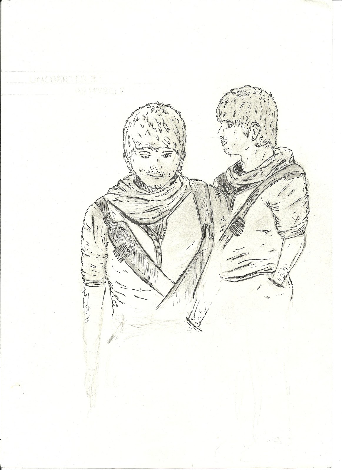
        A couple of weeks ago, I had learnt how to draw heads, faces, bodies and feet. From this knowledge and practice, we were set the first assignment of the module - to utilise all of this knowledge to complete a character sheet of myself as a character from my favourite Video Game. My favourite game is Uncharted 3, however before I completed the assignment, I had an attempt in class in order to highlight where I needed to improve - that attempt is below;


   This attempt, although successful as an attempted drawing, did not fit the aims of the assignment - to draw a character as a full body sketch and a front and side view of the head. However it did offer the practice I needed for drawing myself from the front and side. I believe the head was successful, especially the side view, the proportions are perfect, but the body is a disaster now I look at it. The shoulders are too broad on the front view and the shoulders are too small on the side-view, couple this with the fact that the side view's arm is comically short and you have a drawing that is fine as a first attempt, but not good enough as to be an exhibition of the knowledge I've gained. Regardless however, the point of this was to practice and learn, in that sense this image was a astounding success.

NEXT POST: TASK 1 - YOURSELF AS A CHARACTER (HAND-IN)

LEARNING FEET

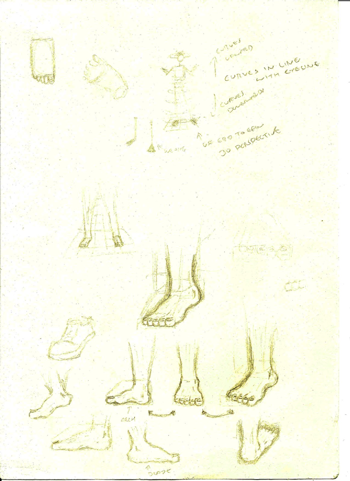
         Drawing feet is another culprit when it comes to impossible body parts to draw. Considering I always gave up drawing before I managed to get to the legs, I practically have no experience of drawing feet. Thus, this part of the workshop was incredibly useful to me. Similar to when I learnt to draw the head, the body and the hands, drawing the feet starts with the most basic of shapes until after adding the layers, becoming realistic.

   Firstly I started with the foot from above. To achieve this, a rectangle was drawn and from that, the big toe, followed by the next toe which is the same size. From this point  the rest of the toes got smaller and smaller until the smallest toe had been drawn. Then I had the side of the foot, which started with a skewed parallelogram - the shortest side being the area were the toes are. From this containing shape I could draw in the basic shape of the foot - the most important parts being the arch of the foot, the heel and the ridge. Once these had been drawn in, it was a matter of detailing the foot.
   
   Finally I had to draw a foot in a perspective view, which you can see in the middle of the scan below. Firstly, I drew the skewed parallelogram in a perspective view just like the side view. From this I drew in the toes to get an idea of the angle of the foot and then the arch and heal was drawn in considering the angle of the containing parallelogram.

   After learning these techniques, I decided to draw the same foot, from the side, the front and at an angle in order to further my skill in drawing feet. Once I start to develop my own character sheets this skill will be invaluable. 


All in all, when learning how to draw feet, I learnt;
  • The feet are made up from a rectangle or a parallelogram
  • Perspective is incredibly important when drawing feet
  • The big toe is the toe you should start with


   Now I had learnt how to draw the head, the face, the body of a male and a female, the hands and the feet, I had to revise my knowledge and utilize it in the first of this modules assignments - to draw an entire character.

NEXT POST: TASK 1 - ATTEMPT

LEARNING HANDS

        Hands are one of the hardest parts of the human body to draw. The sheer complexity of the hands - the fingers sizes, the perspective and the wrinkles are all crucial in not just drawing a hand, but making it realistic.  Up until the day I was taught how to draw hands, they where a body part I avoided with a passion - if I drew a body, I'd always leave the hands for another day, which never came.

   The first part of the workshop was learning how to draw the hand itself. Much like drawing the hand and the body, I learnt you start with blocking out the positioning and basic shape of the hand. Starting with a square for the palm of the hand, a single line is drawn directly from the middle of the square as a reference for the middle finger- this is the longest finger. From the middle finger, the next two are drawn on either side, both of which are the same length. The final finger is the small finger, which is slightly smaller than the two previous fingers and finally there is the thumb. Firstly, an equilateral triangle off shooting from the side of the square is drawn, from the top of this triangle the thumb is drawn. Now the entire hand is drawn in it's basics, and all that is left to complete is the minute details to define the individual characteristics of a hand.

   We was then taught how to draw hands holding objects with two main tips - one, reference a model and two, start with the basic shapes of the hand. From those tips and the lesson in drawing the hand itself  the below practice session took place.


   In that one session, I learnt how to draw hands and how to draw hands holding objects such as a ball, a cup and a pencil. Through practicing theses I learnt not only how to draw the hand itself, but how to draw the hand at different angles and perspectives, giving me a more comprehensive knowledge on drawing the hand. Since learning and practicing, I can now draw hands without thinking too much into things, and I believe the images above highlight this success. In all I learnt;

  • The hand is built from a square, a triangle and a line
  • The middle finger is central and the longest
  • The fingers next to it are the same length
  • The thumb is an offshoot of the triangle
  • Referencing is an effective tool of practice

NEXT POST: LEARNING FEET

LEARNING BODY PROPORTIONS

        The head was always something I could comfortably sketch to some extent (until I had to draw the facial features), however the body was always a task that was easy enough until I got below the shoulders. That's when my drawings became complete failures - arms were longer than the legs, the legs were too short and the waist was always too square. Therefore in Lecture 2, where I learnt how to draw the body to proportion, I came heaps and bounds from where I was. 

   We started by drawing a entire character to measure our ability to draw the body, from there we were then taught to techniques of proportion. The first attempt is below;


   From this initial drawing, we was then told the individual proportions of the body before finally using that knowledge to practice sketching the body as a basic skeletal frame (image below). Within an hour I learnt;

  • The body is generally 8 heads in height
  • The body is generally 3 heads in width
  • The joint of the arm lands directly in the middle
  • From head to hips is the same length as from hips to feet
  • Hands should land half way down the thighs
  • The Knee is half way up the leg


   Already you can see how I'd progressed from the first body sketch. From these quick sketches I had mastered the measurements of the general human body. I now needed to draw the body from the side. However one further problem I'd always had was to differentiate a male from a female when drawing without reference images. I was taught both and practiced both in the next session.


   Two main tips were taught to me when drawing women - one, draw men with straighter lines and woman with curved lines and two, draw swimsuits on woman to get the figure correct (a personal aid the tutor used to use). From this I believe I managed to achieve the female figure, however I wouldn't call it a complete success, further practice is definitely needed. All that was needed now was to learn the hardest part of drawing the anatomy - the hands and feet.

   Overall, that one lesson in drawing has been the most useful drawing lesson I've ever had. From what I learned here coupled with what I learned the week on head proportions and facial features, I can now confidently draw any character I wish to with realism. However, I still need practice on both, as my drawings currently look like drawings completed by someone who's just taken a class in drawing basics (which I had) where as I want to be produce natural and accomplished work - the kind of work people look at an wonder how it was achieved.

NEXT POST: LEARNING HANDS

LEARNING HEAD PROPORTIONS

        The first lecture of creative thinking introduced me to drawing the head. Through drawing techniques learned in class, the structure of the head, the position of the eyes, the nose, the mouth and ears became natural to draw through the use proportion. After practicing the head in its most basic form repeatedly, I could draw the head confidently - all I needed to add were facial features. Below is my attempt at drawing heads for the first time, ignore the main drawing on the first page, it was an ice breaker for the beginning of the semester to gain insight into our own ability up to that point. It is also important to note that the first page has been developed upon since thus, they are more detailed than they originally were. 


   Here I began with the basics - drawing a circle for the skull, then a trapezium that would eventually become the jaw. From this I was taught to draw a line that interconnects both shapes for the eye-line, as they land exactly half way down the head. Half way between the eye-line and the bottom of the head another line is drawn that marks the tip of the nose, and then finally a line is drawn in between the nose and the bottom of the head for the lips. From this you could draw the facial features at their basics and then place the ears in-between the nose and eye-line. I was told not to worry about having the ears protrude from the head, and it was an effective tip.

   As you can see I experimented with the shapes and sizes of the circle and trapezium that made up the head and came out with various characters distinguishable from one another.


   Next we were taught to draw heads from the side, which in terms proportion were identical to the front view of a head - the difference here was the original shapes that make up the head. Starting with an oval rather than a circle, and a line drawn down from the side of the oval (in this case the left-side), then upwards at an angle to create a triangle for the jaw line, the head from the side was almost complete. Finally through drawing a short diagonal line from the back of the head at the same angle as the jawline then continuing it on in the opposite direction to create the back of the head and the shoulder line. Again if you look at the the image above, I experimented and came up with more characters.

   As you can also see on the scan above, I was taught how to draw eyes successfully. This is something I still haven't mastered, however, regardless of my inability to perfect the eye I believe my attempts were admirable. My last quick attempt at drawing the head was to ensure both the front and side view of the head were identical in character, shape and proportion - this way when it came to character sheets I could develop accomplished pieces of concept art. This last attempt is below;


Finally we were given the task of drawing a full head utilizing all the techniques we had learnt in the workshop. The result is below.


After learning the simple techniques to get the proportions right for the front and side of the head . In all I learnt and practiced;

FRONT-VIEW OF HEAD
  • Made up of circle and trapezium
  • Eye-line falls exactly half way down the head
  • Noise falls half way between eye-line and tip of the chin
  • Mouth falls half way between the nose and the tip of the chin
  • Ears lie between nose-line and eye-line
  • Ears can protrude from head
SIDE-VIEW OF HEAD
  • Made up of oval and triangle

NEXT POST: LEARNING BODY PROPORTIONS

Tuesday, 9 October 2012

INTRODUCTION TO BLOG


        Drawing has always been something I've practiced, long before I attempted to model or design games, however I've never mastered the individual details that build realistic proportion. My artwork has always been admirable compared to most people’s standards, but my work was always inexperienced and flawed. Thus, this module is something I wasn't actually expecting and in result was pleasantly surprised when I was introduced to it. In this module I've learnt more about the art of drawing than I have done in all my years in education. In one lecture I have learnt to draw faces confidently; something I've always found difficult.

   Throughout this module blog you will see regular posts on drawings, portfolio development and personal work. You may also see a couple of miscellaneous posts that I believe relate to this module as reference for myself. You will see this through scanned images and texts.

   The purpose of this blog is to record such progress as an artist with paper based art and digital art. Couple these two together, and I hope that in 3 years time I could look back on my work and see how I've improved, be able to put together an accomplished piece of artwork, and apply it to other crafts such as 3D Modelling.

   Therefore as a starting point my first posts in this blog will show my practice with drawing the head, the body, the hands and the feet, then moving onto full body sketches and assignment work.

NEXT POST: LEARNING HEAD PROPORTIONS